#MakeoverMonday and Me – 2017Wk44 Public Holidays
My approach to the #MakeoverMonday project Week 44, 2017
Questions
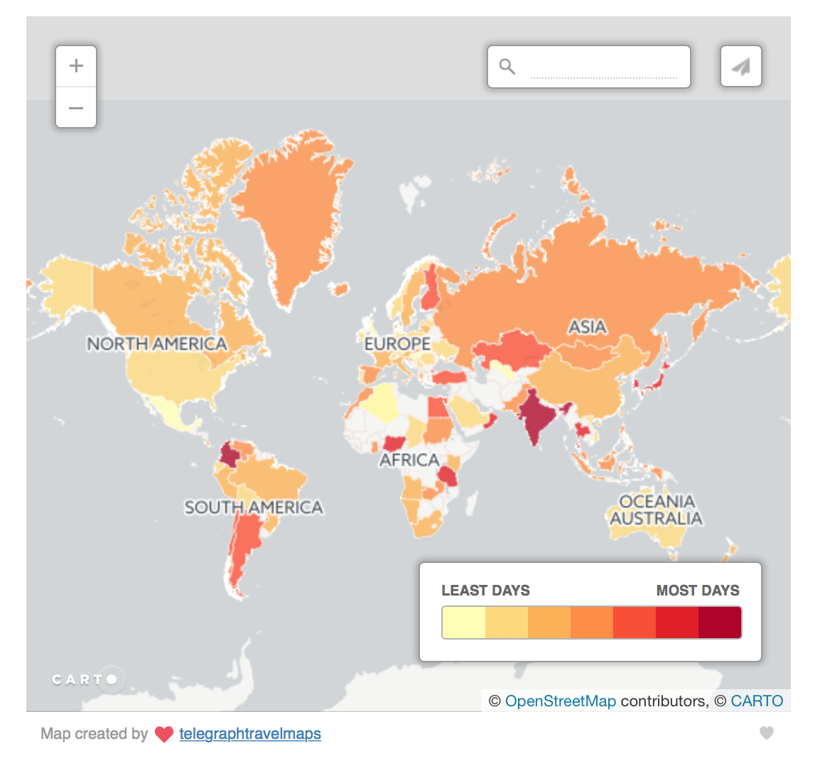
The original visualisation was featured in the Telegraph article Mapped: The countries that have the most bank holidays. It was about countries with the most and fewest public holidays.
While reading the article I was wondering how most of the countries are doing? Are they close to the top or bottom end of the holiday range? What is the average number of public holidays per year?
The map provided a colour legend but no numbers. To find any numeric value I had to click on each country individually. I wanted to know the answer instantly, at a glance.
I also didn’t want the well-known pitfall of a filled map to get in a way of my analysis. All small sized countries are almost unnoticeable on the world map and distort the real picture. So, my next goal was to find another way to show this information without the map.
Data
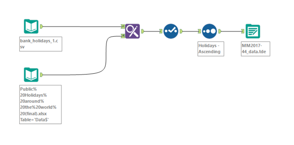
I ran into a few challenges with the provided dataset. As was mentioned by several people on Twitter, it was impossible to filter ‘Holiday Types’ so that the number of holidays would match the original visualisation. At least I could not. And when my numbers do not match I get a bit paranoid.
Previously I would put the data aside with the intention to work on my makeover later, and then never finish it. Yet this week I was determined to complete my submission for #MakeoverMonday.
I noticed that the original map points to telegraphtravelmaps. I followed the link and was lucky to discover that the map itself was accompanied by the dataset. Even more lucky was that the data was available for download in various formats.
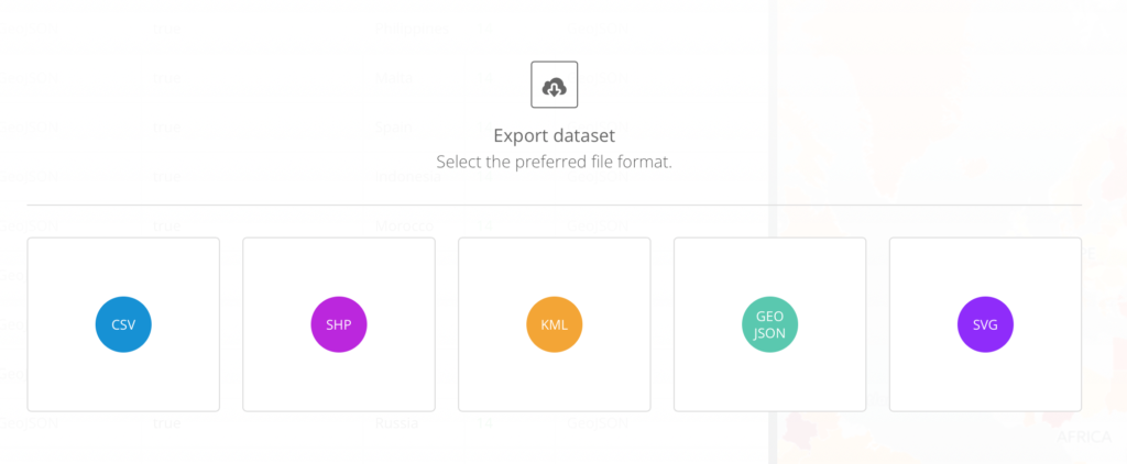
I chose csv format so I could then run it in Alteryx to add regions, which I did not use in the end.
Design
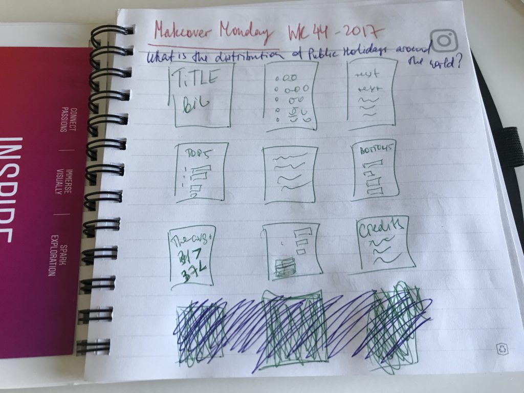
When I hear the words Public Holiday, calendar is the first thing that comes to my mind. In most countries, public holidays are pinned to the first/last Mondays or Fridays of the month, so that they always form a long weekend. However, where I grew up, all public holidays were on a specific date. Everyone was checking their calendar to see on what weekday the holidays fell in the given year.
I did a quick Google and Pinterest search for inspiration. The most common image of a holiday calendar featured a 24 day Christmas countdown. I didn’t want my viz to be Christmas specific, so I settled on a common calendar layout.
Process
Originally, my sketch had 12 blocks, one representing each month. I planned to fill them with either a chart or text. I very quickly realised that I don’t have enough material to fill in all 12 boxes, but what I had was pretty much answered my main questions for this dataviz. I choose to let go of the last row which made my viz look less like a calendar. Well, at least I was not adding clutter in order to preserve the design idea.
At first, I used a different more neutral colour scheme. The dashboard was very flat and didn’t suggest any holiday mood. I went on the Internet to search for free images with party lights. I guess they do look a bit like Christmas lights, and I think the new colour pallet suggests some Christmas references.
This was also my first attempt to do an all-floating dashboard. I love containers and I love them tiled, but seeing how the floating technic enhances design capabilities in Tableau I was curious to try it. Initially I couldn’t decide on the length and width of my boxes and ended up laboring the size of the dashboard and all the elements for quite a long time. I wish there was an option to lock the dimensions of each dashboard object separately and that changing the dashboard size wouldn’t affect them.
Output
This is a pretty simple dashboard though it took me well over an hour to complete. The final viz was well received and even made it to the weekly favourites which I am very excited about.